How might we create a fun way to cook with what we have.
CHEFABLE – Mobile app concept
Prepare a delicious meal, and share it with your loved ones or embrace it on your own! Pick your preferences, pop your ingredients and start browsing the library of 6000+ recipes today! Everybody can be a chef from time to time, so can you!


1. Introduction
1.1 Background
I love food, cooking is my hobby, and I like to experiment with different recipes. However, sometimes I have to rely only on what currently I have available in my fridge, or finish some leftovers.
1.2 Defining the problem
Finding a recipe through existing apps, blogs, and youtube videos that fit into your current palette of available ingredients is not efficient and can be frustrating at times. Either utility or usability is low.
1.3 The Solution
Creating simple, visually appealing and fun to use app for searching recipes by ingredients.
2. Process
User Interviews / Personas
To create the requirements for my project, I interviewed a few friends who share my passion for cooking. I consolidated data into two user archetypes.
The efficient user (me included) who is more pragmatic, measures the macros, follows a particular diet and likes routines. Have an organised approach to looking for recipes, sets the preferences upfront for more efficiency in further use.
The spontaneous user who likes to experiment with food hates the routines and has a more open culinary palette, and enjoys freely exploring the app without any setup, commitments or filters.


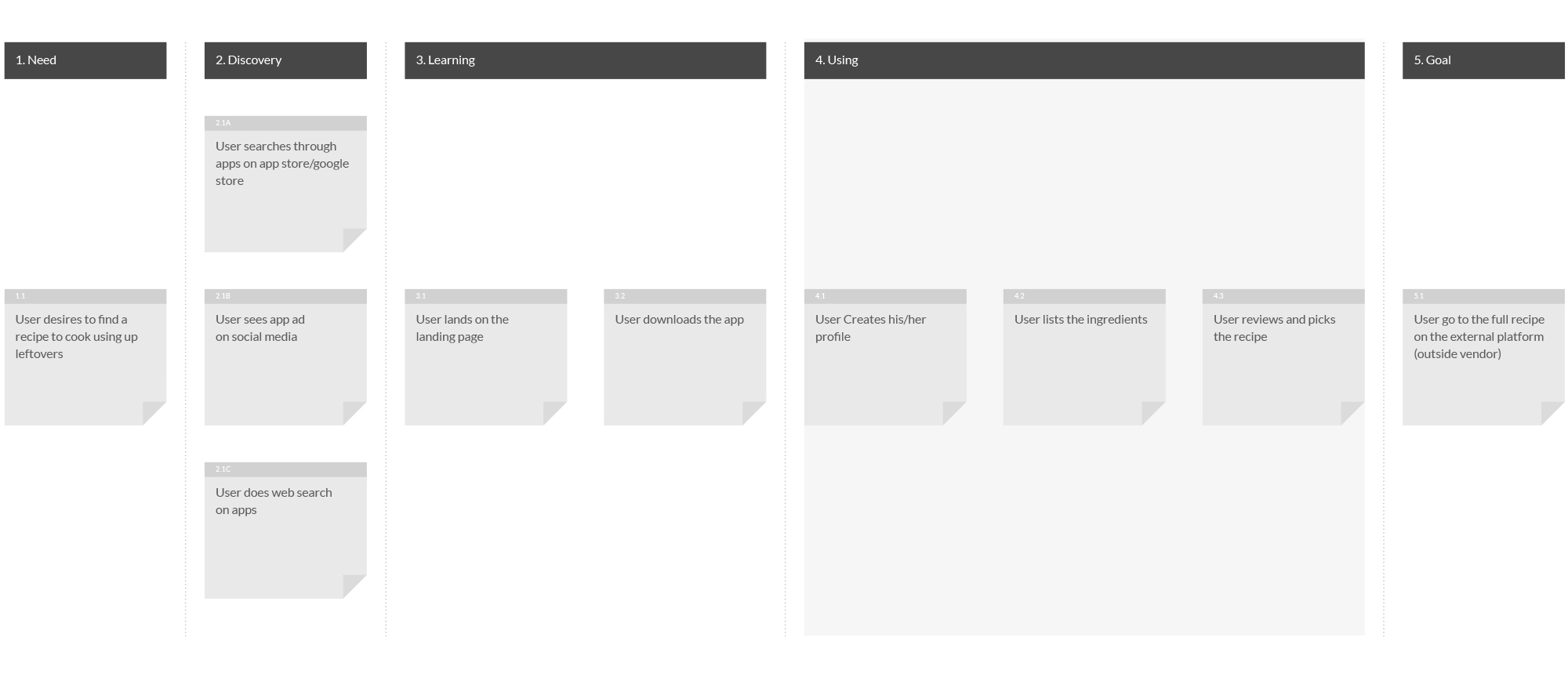
Map / User journey
Then I created a simple user Journey map, that helped me to empathise with the users and imagine their whole journey from the spark of a desire to eventually cooked meal.
Requirements
Based on the gathered insights from the user interviews and my own experience, I created a list of requirements which will guide me through creating the main task flow.
As a user I should be able to:
- Set my basic preferences/filters at the beginning, such as allergens, diets, cuisines, disliked foods, cooking skills and equipment.
- Insert ingredients to find relevant recipes.
- Scan the bill from the grocery store to get the ingredients in.
- Add recipes to favourites and rate the recipe.
- See essential information about the recipes on the search results screen.
- Learn what ingredients I have missing.
- Learn how to do the recipe step by step.
- See all the needed ingredients for the recipe
- See the macros for each recipe.
- Use my previous ingredients sets.
- Change my preferences at any time and quickly.
- Have an option to pick a random recipe.
- Use temporary filters during the search (prep time, type of meals, amount of people)
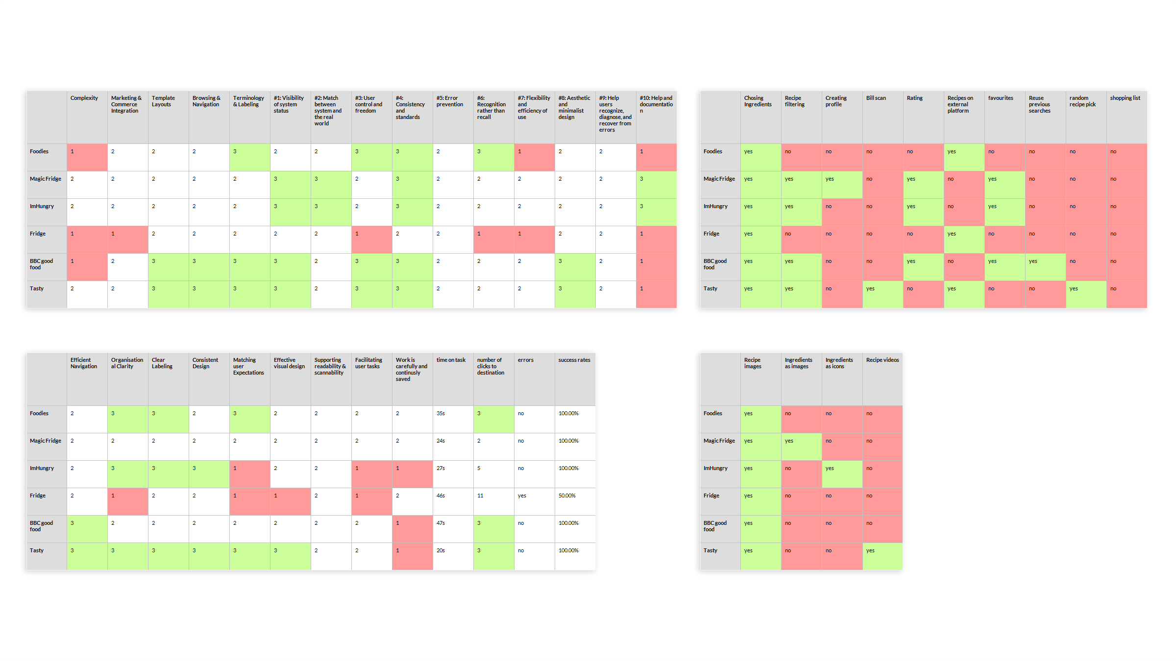
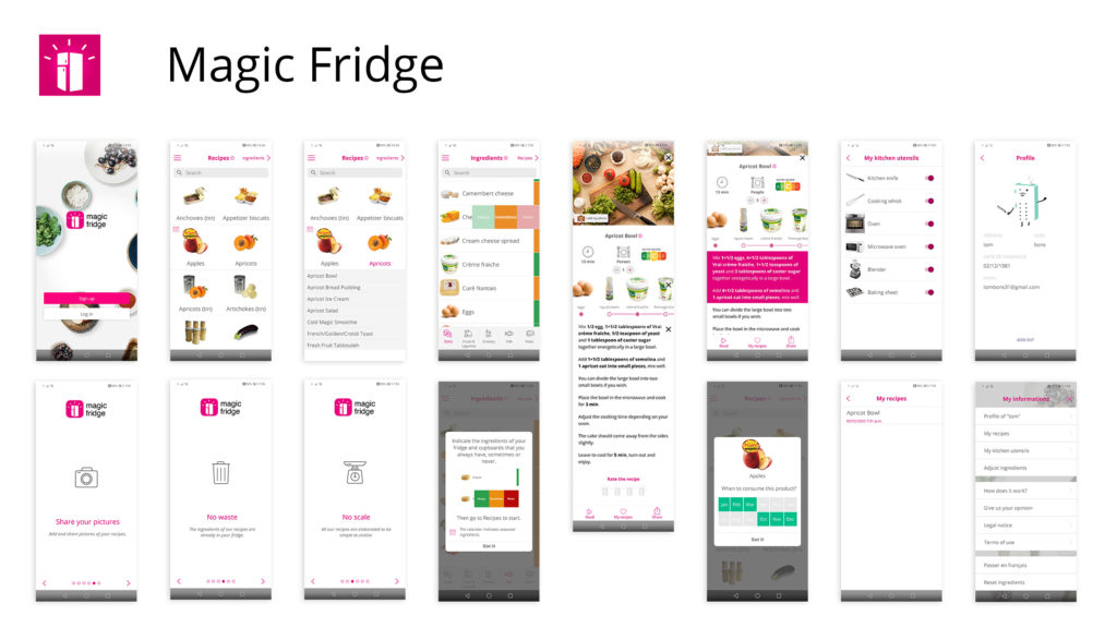
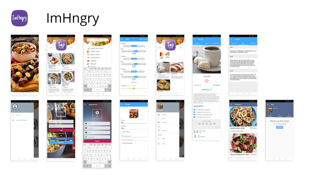
Market research through competitive and comparative analysis
Before commencing further work, I conducted simple market research and analysis to discover how the potential competition and similar apps handle the usability, review the current trends in the sector, note any important outside consistencies, and gather information about content and functionalities.
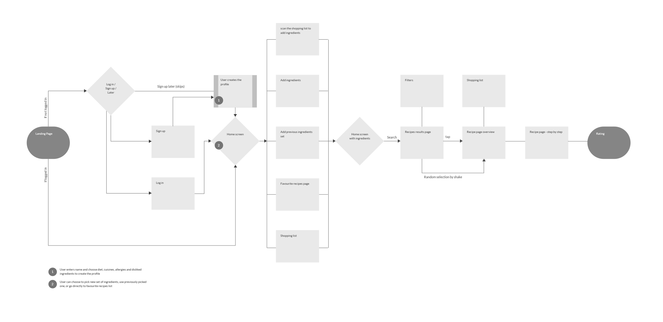
Flow chart
The first step after gathering the requirements and market research was creating a main user flow which contains the whole experience of using the app, broken down into cards, from the landing page to the last screen where the user rates the recipe after the cooking.
Building a quick clickable prototype using Adobe xd and going through it quickly a few times gives me an idea of the flow, and whether it feels natural and smooth. I experimented with different structures and picked a variant which felt natural and simple.
Exploration and sketching
Having the main user flow chart ready I’ve divided it into smaller screen sequences such as setting up preferences or recipe exploration and started ideation/exploration session where I translate the flow cards into screen sketches.
It’s a stage where I’m trying not to limit myself and draw as many iterations for each screen or screen sequence as I can.
The tools vary from project to project, but in this case, I did the session in photoshop using my Wacom tablet.

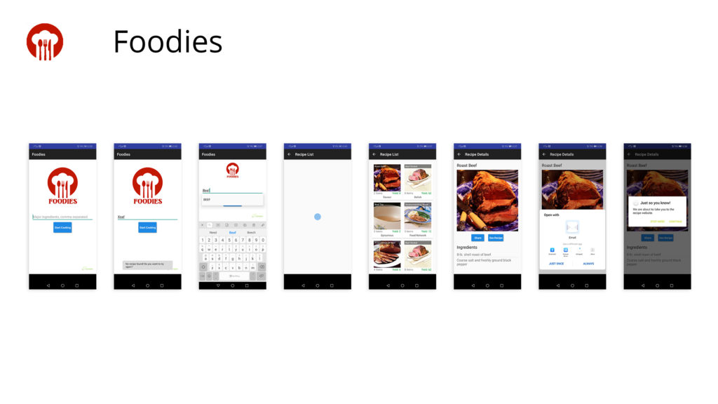
Task flow / Low fidelity wireframe
Using selected screens and screen sequences from the ideation phase as references I designed in xd a low fidelity prototype.
I did a few usability tests with my friends, gathered insights and recommendations, and made the necessary updates.
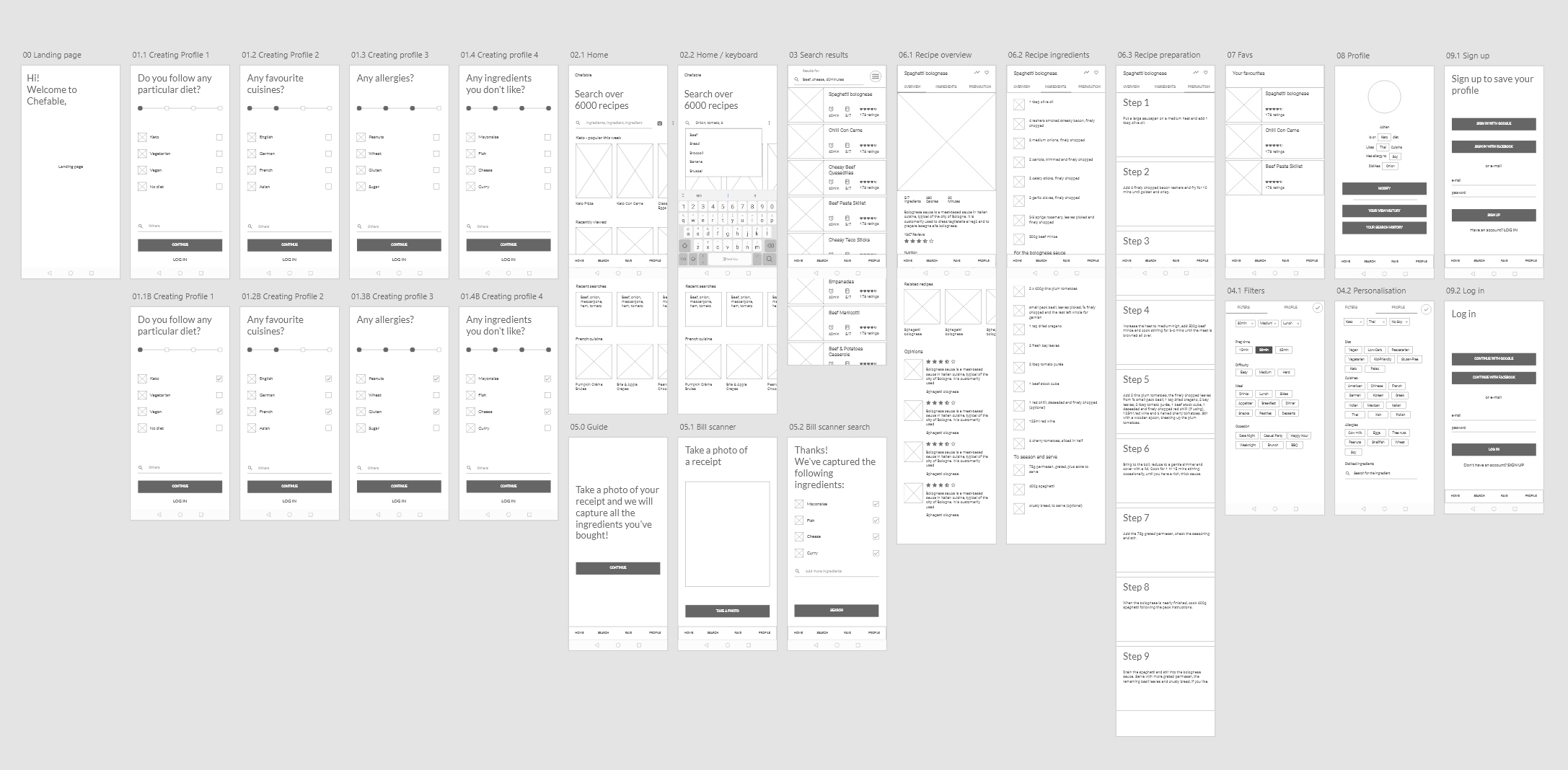
3. High Fidelity Mockups , visual design and interaction
Brand language development
Before the high fidelity design, I developed branding and visual language for the app.
I started with naming,
then designed logos for three selected name propositions.
After that, I created a mood board for the chosen brand idea (Chefable).
Using mood board as a reference I designed five key screens which will serve me as a point of reference while I’m designing each screen in high fidelity.


High fidelity mockups
I aimed to keep everything simple and clear as possible to leave enough visual space for beautiful food images.
Besides the onboarding where I allowed for more colour to boost the brand impact, I used the colour only for important interactive elements.
I introduced the flat graphics of chopped vegetables to add more personality to the solid pink screens and to reinforce the visual idea for the brand “chopping”
Icons are very simple and outlined, to not compete visually with the images that are only dedicated to recipes.
Implemented a cooking-related graphics formed out of lines as a primary graphic element to convey messages in a distinctive way. It’s a gap I found during the market research non of the other apps in that segment uses this visual treatment, plus it greatly enforces brand and adds personality to the design.


Onboarding
The whole app in four simple slides:
1. hook,
2. step 1
3. step 2
4. the goal

Setting up a profile
Four simple steps to build your profile:
1. Diet
2. Favourite cuisine
3. Allergens
4. Favourite ingredients

Browsing through the search results
Depending on which user you are, you can explore the app freely by reviewing a lot popular or most recent recipes, or you can input your details, add ingredients and have the search results tailored for you.

Filtering
Within one click, you can access all the temporary filters and the preferences that you’d chosen.
When the user uses the app for the first time, small modal boxes appear throughout for guidance.

Recipe exploration
Three tabs on the top to explore the recipe.
- Overview
- List of ingredients
- Step by step preparation
Design System / Style guide